Accessibility
Automata Lab is designed for WCAG 2.2 Level AA operation across keyboard, screen-reader, zoom, narrow-viewport, reduced-motion, and forced-colors use. The same state-machine commands remain available when the shell rearranges; only their presentation changes.
Keyboard-Only Operation
Use Tab and Shift+Tab to move between control groups. Composite controls then use their standard keyboard patterns:
| Control | Main keys |
|---|---|
| Menu bar | Alt or F10, Arrow keys, Enter or Space, Escape |
| Toolbar | Tab once, then Arrow keys among enabled commands |
| Model tree | Up/Down, Left/Right, Home/End, type-ahead, Enter or Space |
| Tabs and lists | Arrow keys to move; Enter or Space to activate where applicable |
| Grids and Console | Arrow keys, Home/End, and native scrolling or selection keys |
| Splitters | Arrow keys to resize within their announced limits |
| Dialogs | Tab/Shift+Tab within the dialog; Escape cancels |
Native text controls retain operating-system selection, Cut, Copy, Paste, and text editing. Application shortcuts such as Ctrl+N, Ctrl+O, Ctrl+S, Ctrl+Z, and Ctrl+Y remain available when they do not conflict with an active text control.
Chart elements can be selected, opened, moved, resized, connected, and deleted by keyboard. Palette placement is intentionally drag-only, but every semantic state-machine operation has a complete Editor or dialog workflow. A pointer-only Chart decoration therefore never blocks creation, validation, solving, hosting, or simulation of the model.
Focus and Dialog Behavior
Visible focus identifies the active control. Menus, the toolbar, tree, lists, tabs, grids, and Chart use one managed tab stop per composite control so keyboard movement does not require tabbing through every item.
Modal dialogs trap focus until they close and restore it to the invoking control after Cancel, Close, or Escape. A successful Chart command may instead place focus on the new or changed Chart element; deletion returns focus to the Canvas. Nested error dialogs restore focus to the still-open owner dialog.
Entity dialogs require a valid name before confirmation is enabled. Enter advances through fields or confirms from the last field when valid. Destructive dialogs use explicit action labels. Editor deletion deliberately focuses Delete after the user has already requested deletion, while dirty-project and incomplete-project dialogs begin on their safer non-destructive actions.
Screen Readers
Regions, headings, forms, menus, toolbars, the navigation tree, tabs, splitters, grids, dialogs, status, and Console rows use programmatic names, roles, states, and relationships. Numeric controls include their units and limits in accessible names, and error text identifies both the problem and the affected field or model path.
Console severity is announced as Message, Warning, or Error in addition to its letter symbol and color. Safe context actions provide named navigation to the affected page. Connection changes, Solver completion, validation failures, worker recovery, and routing fallbacks are exposed through status, dialogs, or durable Console entries according to their urgency.
Chart nodes and relations have textual names and descriptions. A route using the exterior diagnostic fallback adds that fact to its accessible description. Selection changes are available from the Chart widget and status bar without a noisy assertive announcement for every pointer movement.
High Contrast and Forced Colors
In forced-colors mode, Automata Lab defers to system foreground, background, border, selection, and link colors. Focus, selection, dialogs, controls, Chart elements, and Console rows remain distinguishable without relying on the Light or Dark palette.
Meaning never depends on color alone. Console rows retain M, W, or E symbols and full severity text; server status keeps text and filled or hollow symbols; validation and destructive actions retain labels and icons. The normal green, blue, and red Console accents and connection colors are therefore supplemental cues.
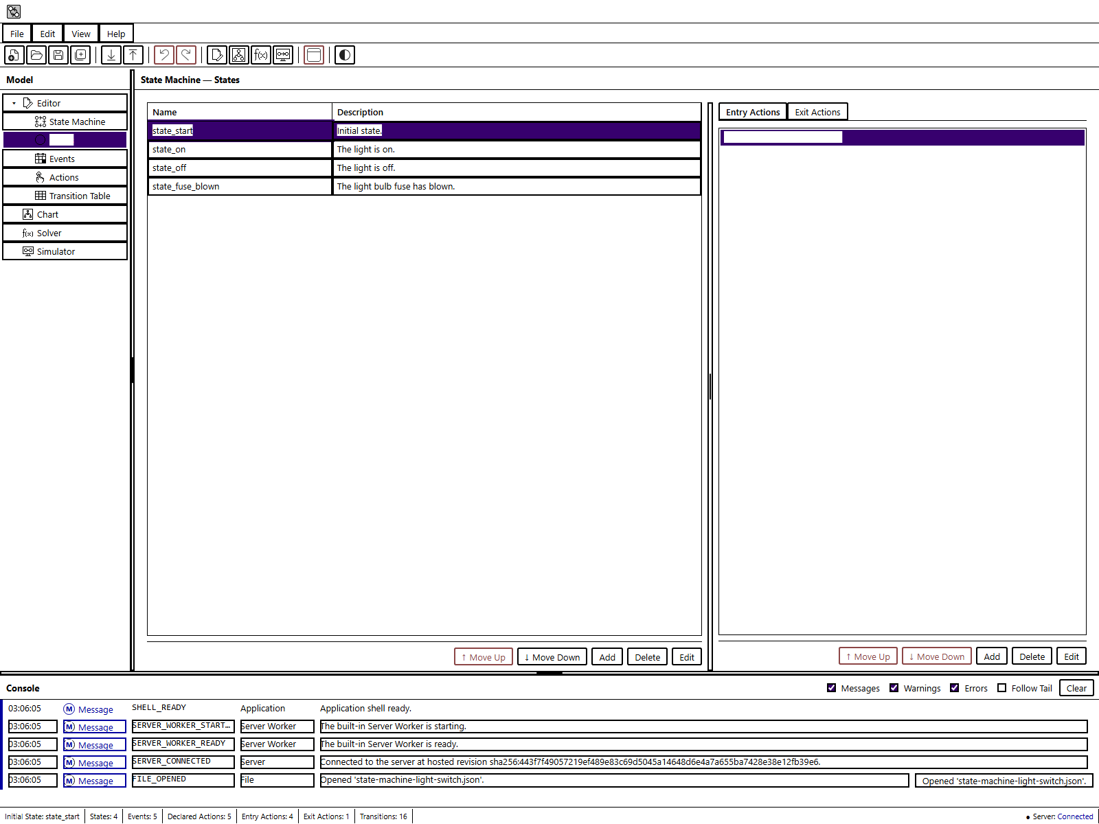
Figure UG-36 illustrates focus, selection, and labeled controls when forced colors replace the application palette.
Reduced Motion
When the operating system requests reduced motion, non-essential transitions and animation are suppressed or shortened. No command, status, diagnostic, selection, or focus indication depends on animation. Automatic Layout and routing still produce the same deterministic geometry; reduced motion changes only how presentation updates are shown.
Zoom and Narrow Viewports
The responsive shell supports 200 percent browser zoom. At 1,280 CSS pixels or wider, the full master-detail shell, Console, and status layout is available. Below 1,280 pixels, explicit Model, Detail, and Console controls show one primary region at a time; shell splitters are hidden.
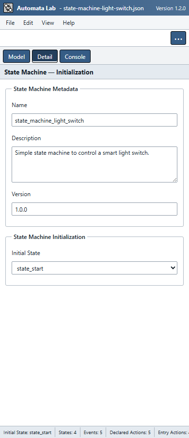
At 320 CSS pixels, the application avoids global horizontal scrolling. Wide data grids and the Chart may scroll inside their own regions. Below 768 pixels, dialog labels stack above values and the toolbar commands are available through More. Application Settings also reflows its labels and values at this breakpoint. Pane action bars and dialog footer buttons remain outside their content scrollers as the window height is reduced. The status bar scrolls horizontally when all fields do not fit. Console hides its code, source, and context columns at this width; widen the window to view them, or copy a focused row to obtain its complete diagnostic text.
Figure UG-35 shows the narrow layout with the same light-switch model used in the desktop screenshots.
Non-Visual Alternatives to the Chart
Chart and Editor are equal command surfaces over one authoring project. Use these textual views when spatial geometry is not useful:
- Editor → State Machine for metadata and initial-state selection;
- Editor → States for state descriptions and ordered Entry and Exit Actions;
- Editor → Events and Editor → Actions for declarations;
- Editor → Transition Table for every configured semantic transition;
- Solver candidate tables and reports for inferred content and replay coverage; and
- Console for validation, route-fallback, file, worker, and operation diagnostics.
Chart-only coordinates, orphan indicators, direct indicator links, and unconfigured drafts have no runtime semantics. Configured terminal-state relations and the accessible state checkbox update the same semantic flag. Their absence from the Editor does not hide a state-machine behavior. Configured Chart transitions always remain available in the Transition Table, and deleting semantic elements from either surface uses the same reference-safe command planner.
Previous: Application Settings
Next: Console and Diagnostics