Application Settings
Application Settings stores global browser preferences for Automata Lab. These values affect the application shell, Chart and Solver presentation, Console and Simulator scrolling, export, server connection, and printing; they are not model content and never make the open project dirty.
Choose File → Settings. The dialog keeps one complete pending preference snapshot. Apply validates and commits that snapshot and closes the dialog. Cancel, Close, or Escape discards all pending changes. Applying relevant Chart settings recomputes effective sizes and routes without adding an Undo entry.
The dialog keeps its action buttons visible while longer settings pages scroll. All settings controls sit inside named group boxes, including groups with one control. At narrow widths, value fields stack below their labels; checkboxes remain vertically centered beside their labels. Group-box titles and rounded corners use the same styling throughout the application, including Settings and Page Setup. Group boxes have equal left and right clearance from their surrounding content edges or vertical scrollbar.
The master list is ordered General, Appearance, Chart, Server, Solver, Simulator, and Print. Each page offers settings; there are no separate Editor or Console categories.
General Settings
The General page contains two group boxes. File Saving contains Save Backup, which defaults off. When enabled, a capable file adapter preserves the previous JSON bytes as a sibling .json.bak before Save replaces the current file. Browsers that cannot update a sibling silently skip the backup, write or download the current JSON once, and record FILE_BACKUP_SKIPPED in Console.
The Console group box contains Follow Tail, enabled by default. It keeps the newest visible Console row in view. Turning it off changes only scrolling; it does not stop, filter, or delete messages. This is the same saved preference previously shown on the Console settings page.
Appearance and Themes
The Appearance page's Theme group box selects Light or Dark; Dark is the default when no stored preference exists. The same choice is available from View → Theme and the toolbar. Modal and main application title bars use the selected Title Bar Color, with a darker shade in Dark mode. A committed selection applies immediately and survives reload in the allowlisted preference store.
The Application Colors group box contains three independent dropdowns:
| Dropdown | Default | Scope |
|---|---|---|
| Title Bar Color | Blue | The main application title bar and every modal dialog title bar. Uses a darker shade in Dark mode and readable title text. |
| Application Buttons | Blue | All application buttons, including dialog, toolbar, workspace, Delete, and Console title-bar buttons such as Clear. Menu items, the Application Settings group list, tab-page tabs, Transition Table dropdown buttons, Palette tiles, and Chart endpoint grips keep theme colors. |
| Console Message Buttons | Gray | Only inline buttons inside Console message, warning, and error entries. |
All three lists offer Blue, Gray, Green, Teal, Purple, Red, Orange, Yellow, Black, and White in slightly darker, muted pastel shades. Gray is slightly lighter, adapting to Dark and Light themes. Text and icons adapt for readability. Dark-mode Console button text is always white, with a subtle dark text edge on lighter fills. Light-mode text retains its palette-specific foreground.
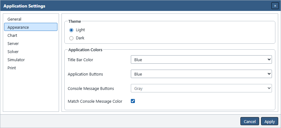
Match Console Message Color appears below Console Message Buttons and is checked by default. Check it to use the same darker pastel Green palette for messages, Blue for warnings, and Red for errors in both themes, including their darker hover and pressed shades. Matched inline buttons use white text and icons. Severity text and accents keep their usual colors. The Console dropdown becomes disabled and remembers its selected color. Uncheck the option to use that color again. Console title-bar buttons, including Clear, always use Application Buttons.
Figure UG-30 shows the matching option and its effect on the Console color control.
Apply saves all three selections and the matching option; Cancel, Close, and Escape discard pending changes. First-time users start with matching enabled; existing saved checked or unchecked choices remain unchanged. The colors persist across reloads without changing the project or exported diagrams and reports. Application buttons use a thin, 1-pixel black border. Console entry buttons and the excluded controls keep their theme borders. Active tab-page tabs are slightly lighter than inactive tabs in both themes, independently of these color choices. System colors take precedence in forced-colors mode.
Theme changes do not modify the project, Chart coordinates, exported model data, or Undo history. Semantic states retain text, icons, and shapes in addition to color. In forced-colors mode, system colors take precedence over the selected theme.
Grid Color is authored against the theme active in the pending dialog. When the other theme is selected, Automata Lab derives a counterpart with the same hue and saturation and comparable separation from the Canvas. Switching back restores the exact authored color rather than repeatedly rewriting it.
Chart Settings
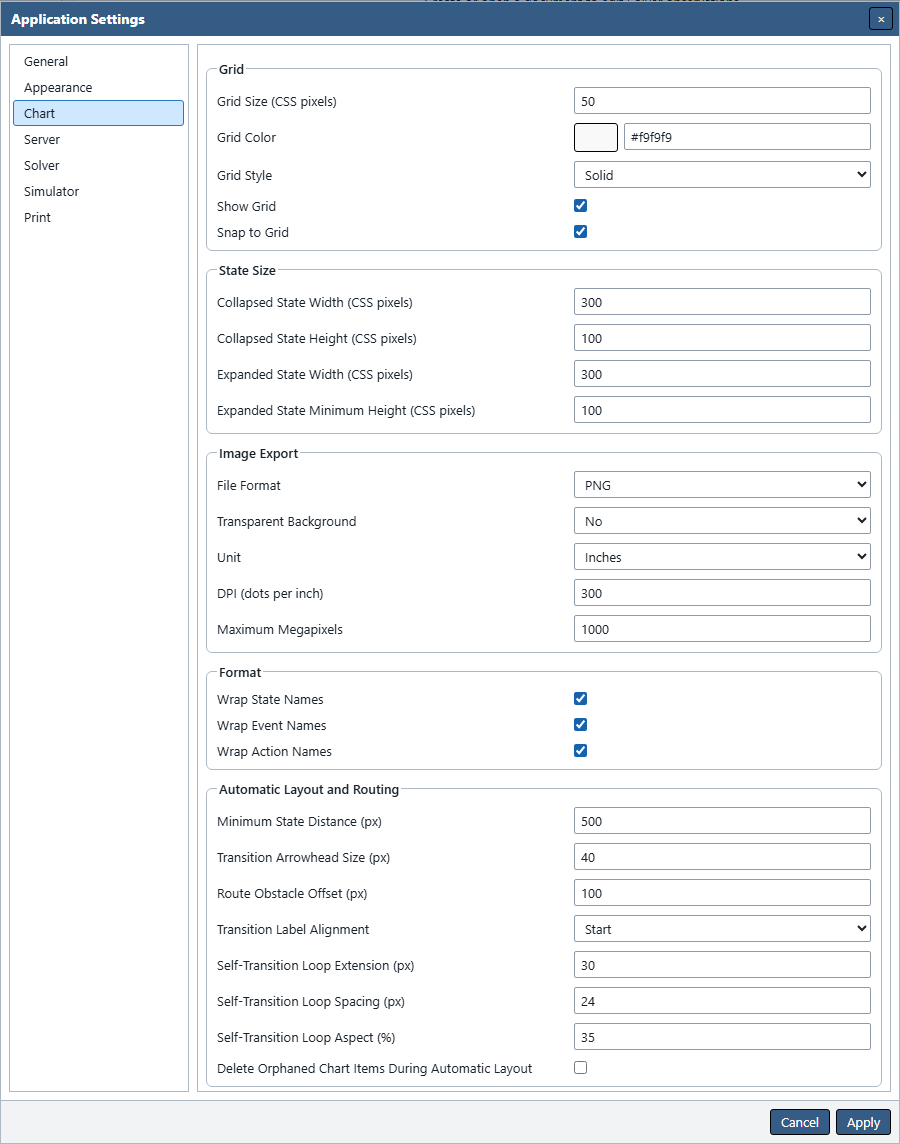
The Chart page contains Grid, State Size, Image Export, Format, and Automatic Layout and Routing group boxes.
Grid
| Setting | Choices, range, and default |
|---|---|
| Grid Size | 10–200 CSS pixels; default 50. |
| Grid Color | Six-digit #RRGGBB; default #1e1e1e in Dark. |
| Grid Style | Dots, Solid, or Dotted; default Solid. |
| Show Grid | Default enabled; also controls whether an opaque image export includes the grid. |
| Snap to Grid | Default enabled for pointer and keyboard geometry edits. |
Grid Style and Show Grid do not control snapping. Automatic Layout always aligns its output to Grid Size even when Snap to Grid is off.
State Size and Format
| Setting | Range and default |
|---|---|
| Collapsed State Width | 1–4,096 px; default 300. |
| Collapsed State Height | 1–4,096 px; default 100. |
| Expanded State Width | 1–4,096 px; default 300. |
| Expanded State Minimum Height | 1–4,096 px; default 100. |
The four sizes are independent global preferences. An expanded state can still grow to fit measured content or a saved user height. Grid alignment rounds nominal dimensions to the nearest grid value and rounds minima upward when necessary.
Wrap State Names, Wrap Event Names, and Wrap Action Names all default enabled. They change presentation and derived geometry only. They do not rename model entities or stale a Solver candidate.
Figure UG-31 locates the Grid and State Size fields within the Chart settings page.
Automatic Layout and Routing
| Setting | Range or choices | Default |
|---|---|---|
| Minimum State Distance | 100–2,000 px | 500 px |
| Route Obstacle Offset | 1–200 px | 100 px |
| Transition Arrowhead Size | 8–160 px | 40 px |
| Transition Label Alignment | Start, Center, End | Start |
| Self-Transition Loop Extension | 1–400 px | 30 px |
| Self-Transition Loop Spacing | 1–200 px | 24 px |
| Self-Transition Loop Aspect | 5–100 percent | 35 percent |
| Delete Orphaned Chart Items During Automatic Layout | On or off | Off |
Minimum State Distance is a center-to-center lower bound for requested Automatic Layout. Route Obstacle Offset controls preferred state- and indicator-obstacle rails; it does not change label spacing or the fixed curve-clearance proof. Arrowhead Size applies consistently to live, draft, SVG, and raster arrows. Start, Center, and End prefer positions at 20, 50, and 80 percent of visible curve length, while collision avoidance may choose another position on the same curve.
The three loop values affect elliptical self-transitions only. Orphan cleanup, when enabled, lets Automatic Layout delete orphan indicators and whole drafts, including attached drafts and drafts with remembered events. It never deletes configured semantic transitions. The deterministic layout and routing pipeline has no user-selectable algorithm or speed-versus-quality mode.
Figure UG-32 enlarges the Format and Automatic Layout and Routing groups from the same settings page.
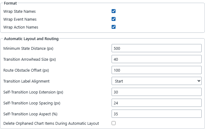
Chart Image Export Settings
The Image Export section supplies the committed settings used by Chart → Save As Image.
| Setting | Choices or range | Default |
|---|---|---|
| File Format | PNG, JPG, SVG | PNG |
| Transparent Background | Yes or No | No |
| Unit | Centimetres, Inches, Pixels | Inches |
| DPI | 72–1,200 | 300 |
| Maximum Megapixels | 1–1,000 | 1,000 |
Transparent Background is available for PNG and SVG. It is disabled for JPG, which always retains an opaque background. A transparent export also omits the grid because there is no Canvas surface beneath it.
DPI and Maximum Megapixels are retained but disabled while SVG is selected. SVG remains vector and does not allocate a raster Canvas. For PNG and JPG, Maximum Megapixels is checked before allocation; reduce DPI or Chart bounds when an export exceeds the selected limit. Unit never changes the meaning of DPI, which always means dots per inch.
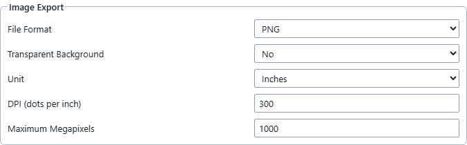
Figure UG-33 locates the committed export preferences. Use Apply in the surrounding settings dialog to save changes before choosing Save As Image.
Server Settings
The Server page contains a Built-in Server group box with a required URL field and a right-aligned Test Server button. The URL defaults to builtin://server, is trimmed when tested or applied, and is limited to 2,048 characters.
Test Server uses the pending URL without first committing the rest of the dialog. It reports handshake, liveness, and readiness through the dialog and Console. The implemented transport supports builtin://; an HTTP adapter is a future extension. A non-empty URL within the length limit can be saved, but connecting to an unsupported scheme fails visibly.
Applying a changed URL immediately attempts to connect to that server. It does not save, push, or pull a project. Use the explicit File-menu commands when you want to transfer the hosted project or disconnect.
Solver Settings
The Solver page contains a Results group box with Default Results Tab. Choose Summary (the default), State Chart, States and Actions, Transition Table, Trace Coverage, Inference Report, or Comparison. Each newly solved candidate opens on that tab. You can still choose another review tab; applying a different default does not switch the tab of a candidate already under review.
This preference affects presentation only. Solver determinism, capacity, scoring, worker bounds, and cancellation remain product contracts. Observation sequences and start contexts are project content edited on the Solver page.
Simulator Settings
The Model Parameters group appears above Traces. Enable Terminal States defaults unchecked and applies when starting or resetting a simulation. Apply saves this browser preference; Cancel, Close and Escape discard the pending choice. A running or terminated execution keeps its captured policy until Reset or a new session. Changing this setting never hides terminal notation or changes saved model flags.
The Simulator page contains a Traces group box with Follow Trace Tail, enabled by default. It controls automatic scrolling in both Transition Trace and Action Trace. While enabled, each table follows new rows when it is at the end. Scrolling away pauses following for that table; returning to the end resumes it. Turning the preference off keeps new rows from moving either table automatically. Re-enabling it while reading older rows keeps your place; return to the end of that table to resume following.
This scrolling preference is independent of Console Follow Tail. It does not change execution, trace retention, or the saved event sequences. Live session state and trace contents remain volatile worker state.
Print Settings
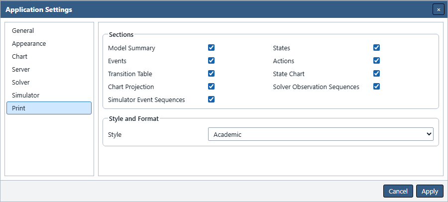
The final Print group contains Sections and Style and Format. The nine section checkboxes are Model Summary, States, Events, Actions, Transition Table, State Chart, Chart Projection, Solver Observation Sequences, and Simulator Event Sequences. Every section defaults enabled and is synchronized with File → Page Setup.
Style selects Academic or Industry and defaults to Academic. Paper Size, Orientation, and the four margins remain in Page Setup; they are not duplicated in Application Settings. See Printing and Export for the complete report behavior.
Figure UG-26 shows the Print page. Compare the resulting Academic and Industry report pages before choosing a style.
Restoring Defaults
Automata Lab does not provide a bulk Restore Defaults button. To restore selected preferences without affecting the others, enter the documented default values in the relevant groups and choose Apply. Page Setup supplies the print defaults: A4, Portrait, 12.7 mm on each side, and every report section enabled.
Preferences are stored as one versioned allowlisted object in browser local storage. Unknown keys are ignored. If the stored envelope is malformed, unsupported, or contains an invalid allowlisted value, Automata Lab substitutes safe defaults and records PREFERENCE_CORRUPT or PREFERENCE_VERSION_UNSUPPORTED in Console. Project documents, Solver observations, Simulator traces, hosted models, file handles, and Console history are never restored from this store.
Previous: Printing and Export
Next: Accessibility